01 · Problem
Generic controls hide the work a studio is trying to show
A salon reel, a makeup tutorial or a maker’s process video lives on detail: the tone of the hair, the finish of a surface, the face at the reveal. Default players stack a dark gradient and a full-width bar over the bottom of the frame, right where hands, hair and faces usually are. On a phone that strip can cover a third of the picture.
- Visual noise. Heavy bars and gradients sit on top of the work, even while nobody is touching them.
- Hidden story. Transformation videos have clear steps (before, process, reveal), yet most players show one flat timeline.
- Guesswork. Hover and playhead look the same, so jumping straight to the reveal feels uncertain.
- Off-brand. One fixed look in one fixed place, even when the bar covers a face or clashes with the studio’s brand.
02 · Concept
A display case for the work: one quiet surface, three sizes
Atelier is French for the workshop where craft is made. The player behaves like a good display case: the work is the hero, and the glass only appears when you reach for it. Controls are one piece of glass that changes size with your intent, chapters tell the story of the process, and a studio can tint the glass to match its brand.
03 · Design decisions
Why it works the way it does
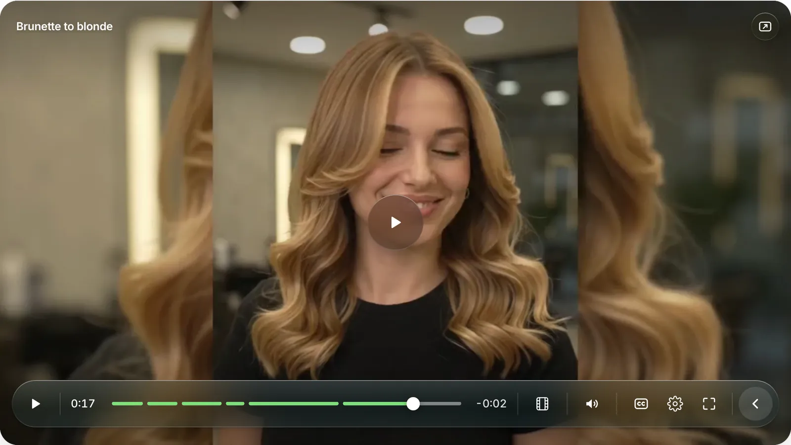
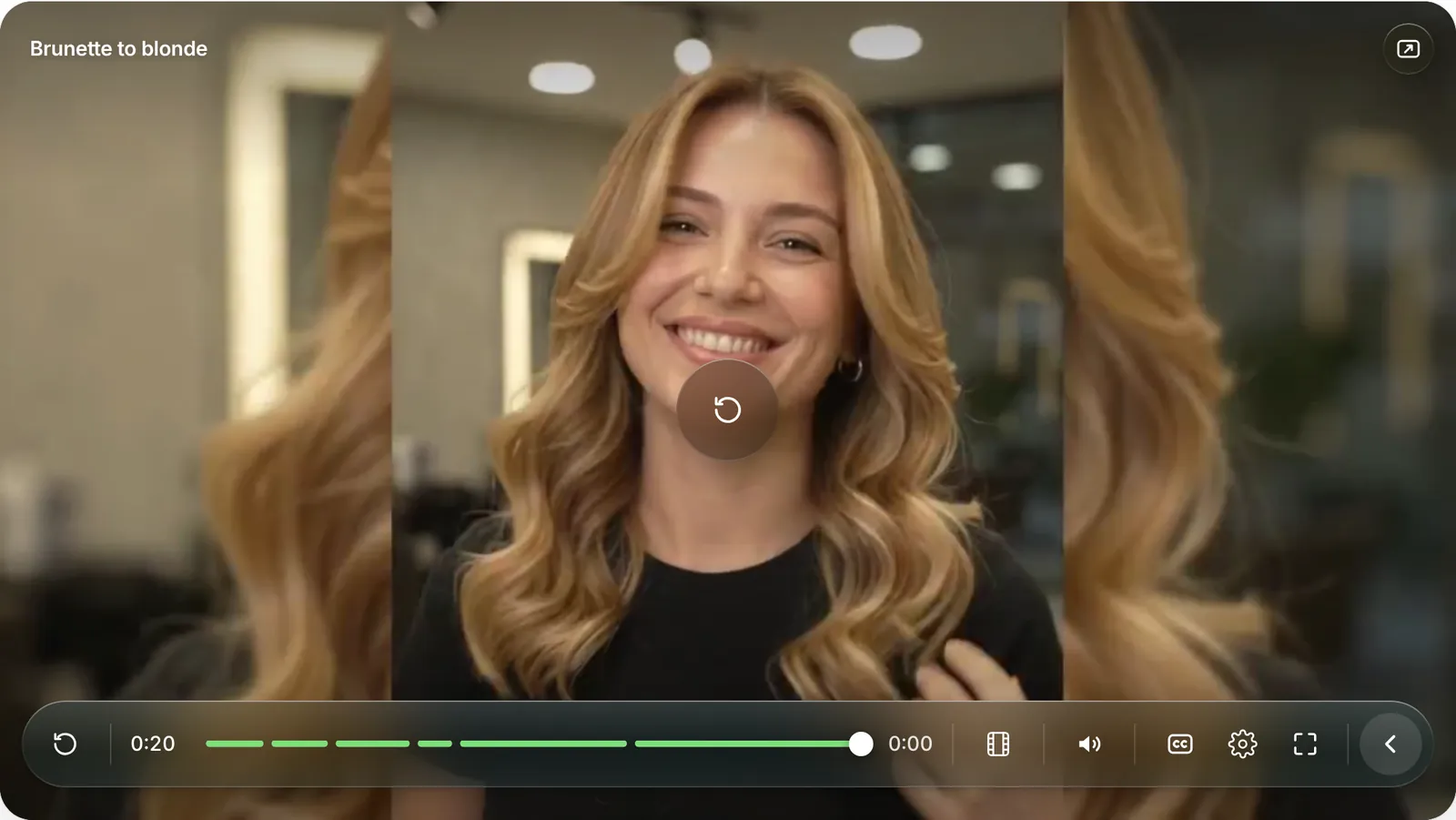
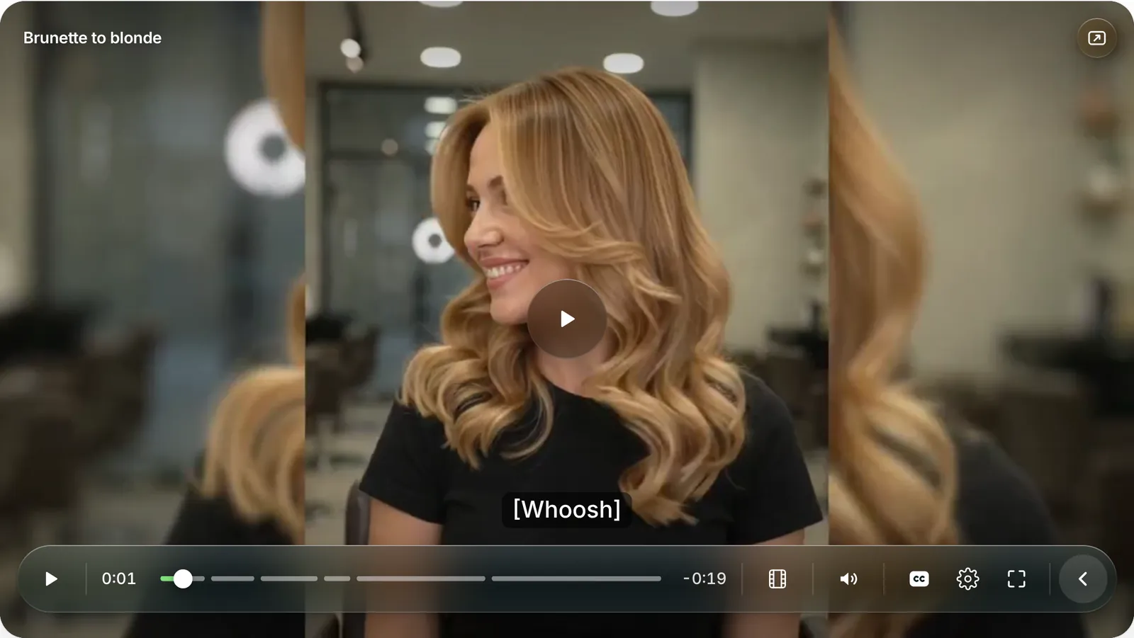
A blurred, tinted capsule keeps controls legible over bright and dark scenes without darkening the whole bottom of the frame.
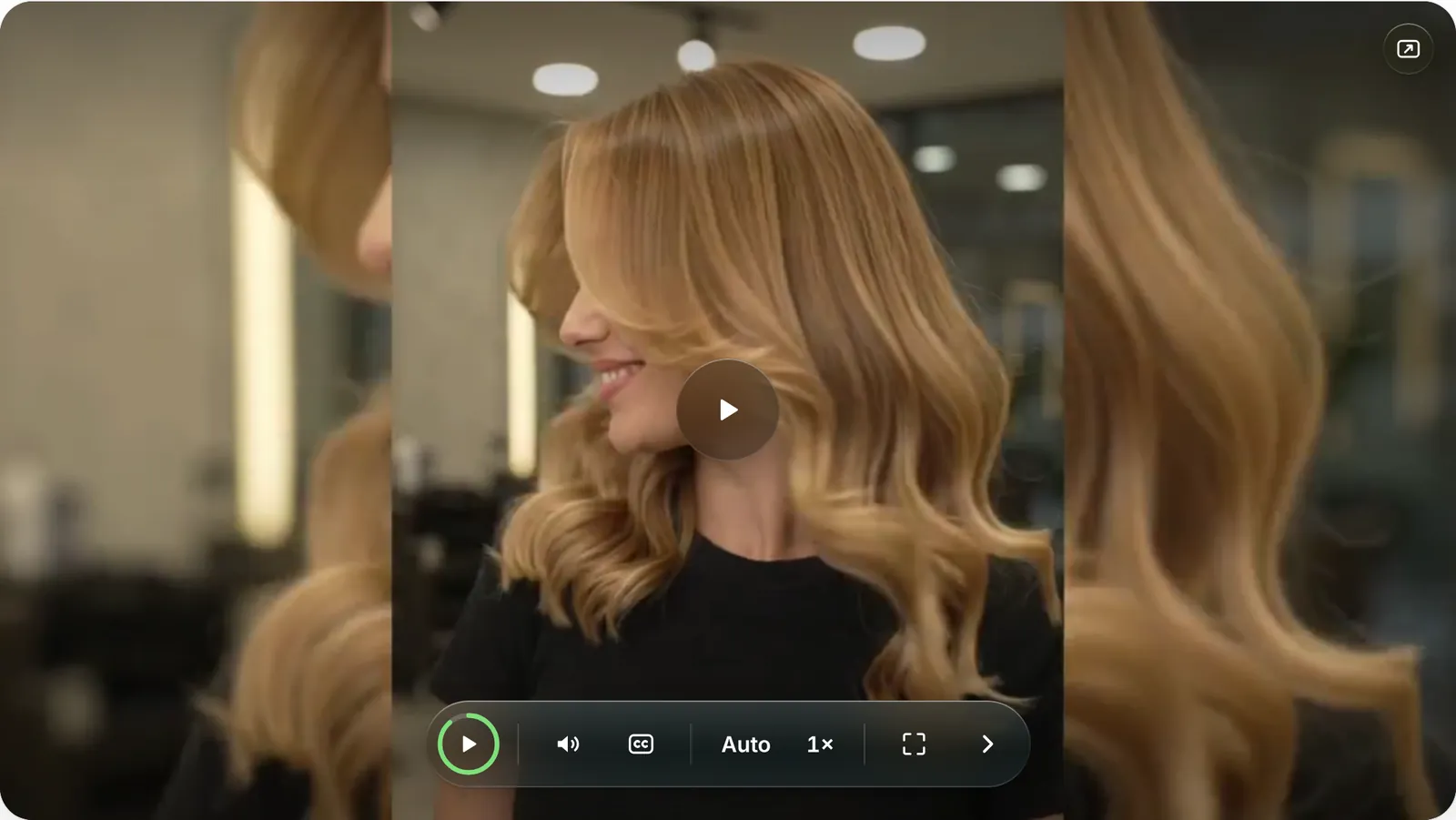
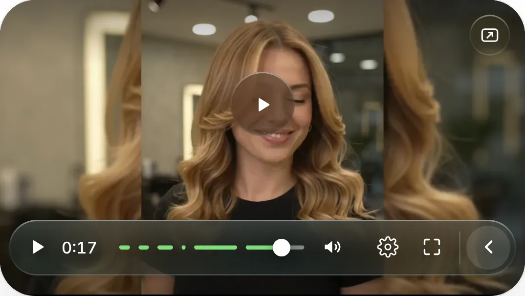
The full bar is for exploring; the pill is for watching. The change is one smooth morph, so people always know where controls went.
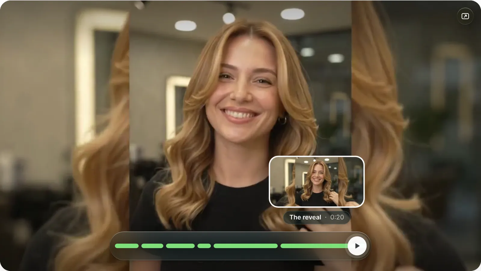
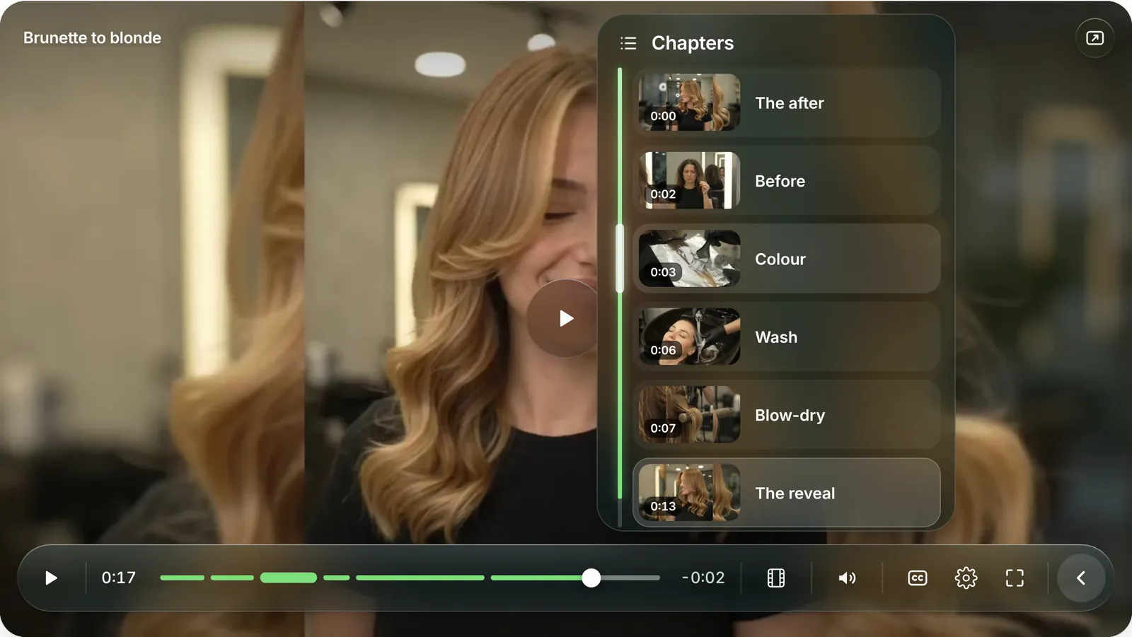
Before, colour, wash, blow-dry, reveal. The timeline only marks where each step begins; names, thumbnails and a live progress rail sit behind one button, so the bar stays clean and viewers can jump straight to the moment they care about.
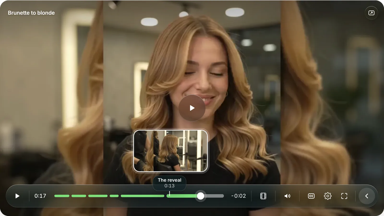
The playhead is a solid knob on a green fill. Hover is a framed thumbnail with a hairline pointing at the exact time, so the two never look alike.
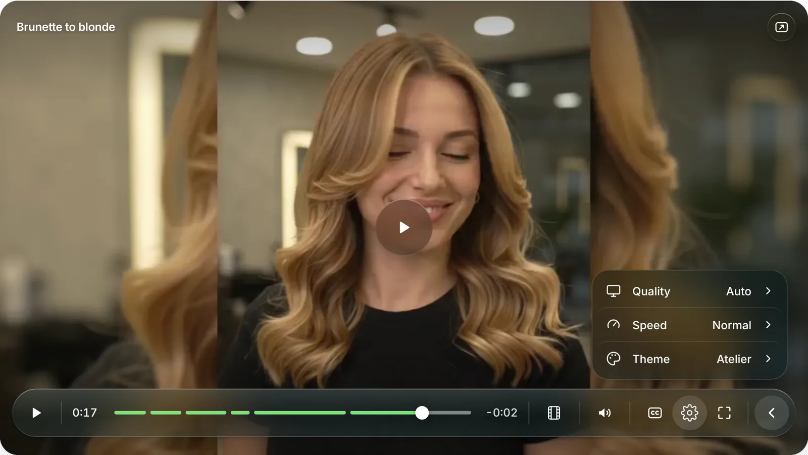
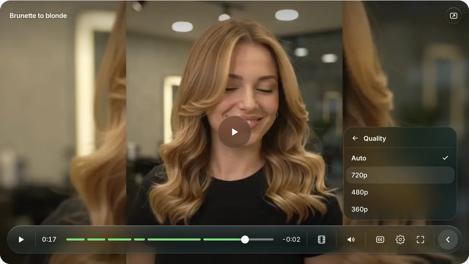
Quality and Speed show their current value; one tap opens a focused list. Fewer choices on screen, the same power one step away.
If the bar covers a face, the hair being shown or the captions, drag it to the top (or press T). Popovers, previews and the title follow.
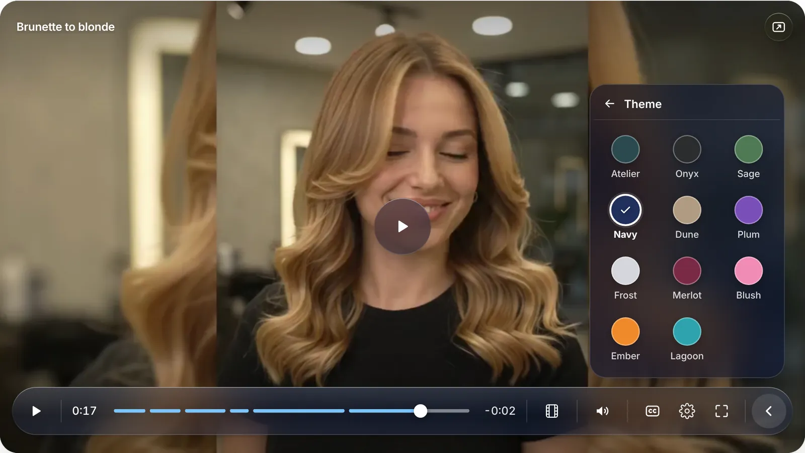
Atelier teal is the signature look. Ten more tints, from Onyx to Lagoon, let a studio match its own brand. Every tint follows the same contrast rules, so icons and time stay readable over bright and dark footage.
04 · Details
Small moments that make it feel finished
05 · Accessibility
Built for keyboard, touch and preferences
- Every icon button has an accessible name and a tooltip; menus use proper roles with a checked state.
- Focus stays visible and controls stay on screen while anything inside them has focus.
- Respects reduced motion and reduced transparency (glass turns solid).
- Hold-to-scrub and drag are extras: every action also has a button or a key.
Tested with keyboard and automated browser checks at desktop and phone widths. A full screen-reader audit has not been done yet, so no WCAG conformance is claimed.
06 · Visual system
A small set of rules, used everywhere
07 · Credits
Inspired by the calm, glass-like feel of Apple's media controls. Everything else is original to Atelier: the bar-to-pill morph, the progress ring, hold-to-scrub, the chapter panel with live progress and hover mapping, the drill-down settings and the movable bar.
Design and build by Angga Ady Ermawan, built on Video.js v10 with an AI coding assistant. Video streams from Mux as adaptive HLS (with a local MP4 fallback). Demo footage is an AI-generated salon clip made by the designer with Google Gemini.